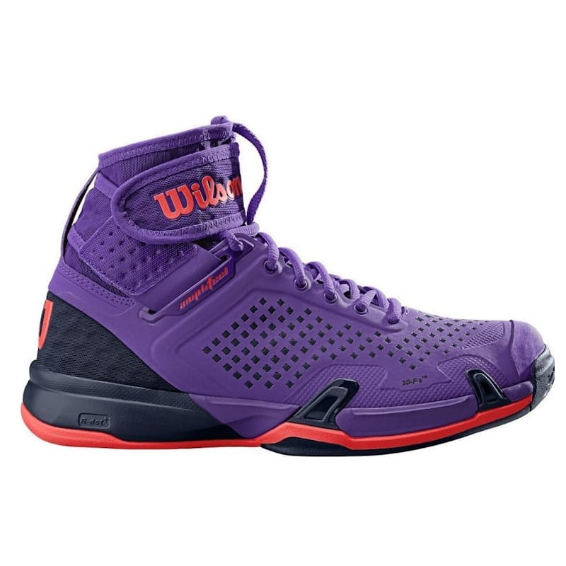
WilsonLadies Amplifeel Tennis Shoes
R729
About
The Amplifeel takes a revolutionary stride in tennis footwear for players who tear up all corners of the court. This shoe features innovative Amplifeel technology for extensive upper support and Pro Torque Chassis arch technology for torsion control and explosive acceleration. If you crave more upper ankle support and dynamic performance from your footwear, this is the shoe for you.
Product Features
- Amplifeel adds increased upper support for feel, control and explosive lateral acceleration
- DF1 provides optimal low-to-the-ground court feel for agility and explosive acceleration (DF1 = HT Drop 6mm)
- 3D-FS delivers unparalleled support, increased response time and explosive acceleration with controlled deceleration
- Endofit Comfort+ provides enhanced comfort, stability and an intuitive fit through a full inner sock construction
- R-DST+ offers the best combination of cushioning and rebound for more dynamic performance
- Pro Torque Chassis uses arch technology to provide torsion control and stability for explosive acceleration
- Duralast consists of a high-density, consummately durable rubber compound that provides abrasion resistance and maximum traction on all surfaces
- Women's Specific Support includes assymetrical and elongated medial side TPU heel counter specifically for women to provide higher levels of stability, arch support and control
Product Specifications
- Collection: Control
- Gender: Women's
- Age Group: Adult
- Weight (g): 367 g
If you were ever wondering...
...what provides the inspiration for these write ups, today's your lucky day. You're about to find out.
99% of the time it's the products. Unsurprising. But also so very corporate and predictable. And we hate that. So once in a while we like to draw our creativity from elsewhere, such as:
If E is the most common letter in the English alphabet, why is it so particular? Surely it should've been shaped like an I, just a single straight line? It seems excessive to have to draw the extra three horizontal lines, when really it could've been avoided.
If you know the answer, as in really truly know, please write to us at EisshapedlikeEbecause@onedayonly.co.za
Otherwise enjoy thinking about that too for the next three or so years.